App Store Promotional Artwork: Tips & Sketch Template
Every Thursday, around noon time PST, Apple refreshes the App Store featuring a new set of apps.
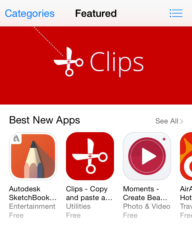
Clips was fortunate enough to be featured by Apple on a number of App Stores this week, coinciding with its launch. That, of course is the best thing that can happen to any developer.
This doesn’t happen out of the blue though. You’ll get some heads-up that Apple is considering to feature your app. This comes in the form of a Promotional Artwork Request email, sent to all of your iTunes Connect Admin and Marketing accounts.
Although we’ve never struck lottery before, we imagine the feeling is pretty much similar when you receive this email.
However, the email tactfully manages your expectations by letting you know that the promotion is not guaranteed. Indeed, there were a number of times where no promotion took place after submitting the artwork. However, to even be considered for the promotion, you must submit a promotional artwork through iTunes Connect before a stipulated deadline.
We’ve missed this email before and almost missed the deadline because it got caught in Gmail’s spam filter. Be sure to set up a filter to never send any email from *@apple.com to spam.
Some developers recommend preparing this artwork beforehand (even before you get this email from Apple). If you’re more disciplined than we are, that’s definitely a good idea.
If you do get selected for promotion (congrats!), the promotion can happen in a number of ways.
First, your app may either be featured in the main section (called ‘Featured’), or just within a category (e.g. Productivity) of the App Store. Since the Featured section is the default view of the App Store, that’s the better place for Apple to feature your app.
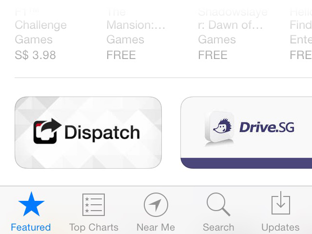
Next, your promo banner can either appear as one of the big banners at the top, or as a small banner lower down in the App Store (as Dispatch has been featured in the screenshot below).
More often than not though, all you get is your app icon appearing alongside other apps in one of the sections like ‘Best New Apps’ (previously ‘New & Noteworthy’). Yep—when that happens, your promo artwork will not be used at all.
We’ve no idea whether the visual appeal of your promo artwork decides whether you get a banner feature, or even the top spot, but we think it certainly doesn’t hurt to make your promo banner as appealing as possible.
It is important to note that most countries have their own App Store editorial team curating what gets featured. So you may get featured in some countries, but not others. And the kind of promotion (featured vs category, big top banner vs small banner vs just an app icon) also differs from store to store.
We think the best place to be featured is of course in the Featured section of the US App Store, as one of the big banner on top.
Preparing the Artwork #
When you log in to iTunes Connect, you’ll find a link to the Artwork Guidelines, along with Photoshop templates for two separate files:
- Background Artwork.
- Title Treatment Artwork.
The link is not accessible to public, so we can’t link it here.
After preparing the artwork for a few years now, we still don’t have a clue what exactly should go into the background artwork and what should go into the title treatment.
But we’ve always put our app icon along with the app name in the title treatment. In Clips’ case, the title treatment contains the scissors motif from our app icon together with the text ‘Clips’, while the background artwork consists of the red background with the dotted cut-here lines. However, we’ll also layout the title treatment as a separate group within the background artwork so that the designers at Apple know how to put them together.
In the past, we’ve always laid out our promotional artwork in Photoshop. But for a while now, we’ve been using Sketch for all our app designs. It has come to a point that we can no longer stand using Photoshop to design anymore.
Since Apple doesn’t provide a Sketch template, we decide to make one ourselves to design the Clips promotional artwork.
However, since Apple only provides the templates in Photoshop format, we weren’t going to try our luck by uploading Sketch files to Apple. What we did was to create two separate groups in Sketch, one containing the elements for the title treatment, the other containing elements for the background artwork. Next, we exported a PDF for each group from Sketch, and imported each of them back into the Apple-provided Photoshop template as Smart Objects and laid them up accordingly. Finally, we exported PSD versions of the background artwork and title treatment before uploading them to iTunes Connect. Sure, it’s not ideal, but at least we minimize the time spent dealing with Photoshop.
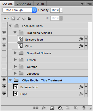
Also, if you’ve localized your App Store description, be sure to provide a different layer (or group) for each language that you’ve localized for in the title treatment file. This is needed even if your app name remains the same for all the languages, as Clips is. Our artwork has been rejected before because we thought the different layers were needed only if the app name is different for other languages.
Here’s how the Photoshop layers look like for the title treatment that we’ve submitted to Apple:
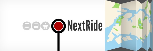
Apple makes it clear that the final artwork is subject to (their) change. For Clips, we were fortunate that Apple’s designers deemed it good enough to be used as it is. This is not always the case though. For example, this was the submitted artwork for an app Hon Cheng helped made:
… but the actual banner that appeared on the App Store after alteration by Apple’s designers looked like this:
Sketch Template for App Store Promotional Artwork #
Finally, since fellow developers and designers might also find the template useful, we’ve decided to share our App Store Promotional Artwork Template for Sketch here.
Licence stuff: You’re free to use or improve on the template to design your own promotional artwork. However, the Clean Shaven Apps logo remains our property. We are not liable if your promotion doesn’t go through, or if anything bad happens to you, your app, your company, or anything or anyone you can think of, for using this template. However, if something good does happen to you, feel free to let us know.
— @jjlin
